Brand Identity & Creative Direction
Olivia
Rose
A full brand repositioning — from undefined beauty label to a focused, quality-driven essentials line for women who take their ritual seriously.
Brand Identity & Creative Direction
A full brand repositioning — from undefined beauty label to a focused, quality-driven essentials line for women who take their ritual seriously.
Campaign & Brand World
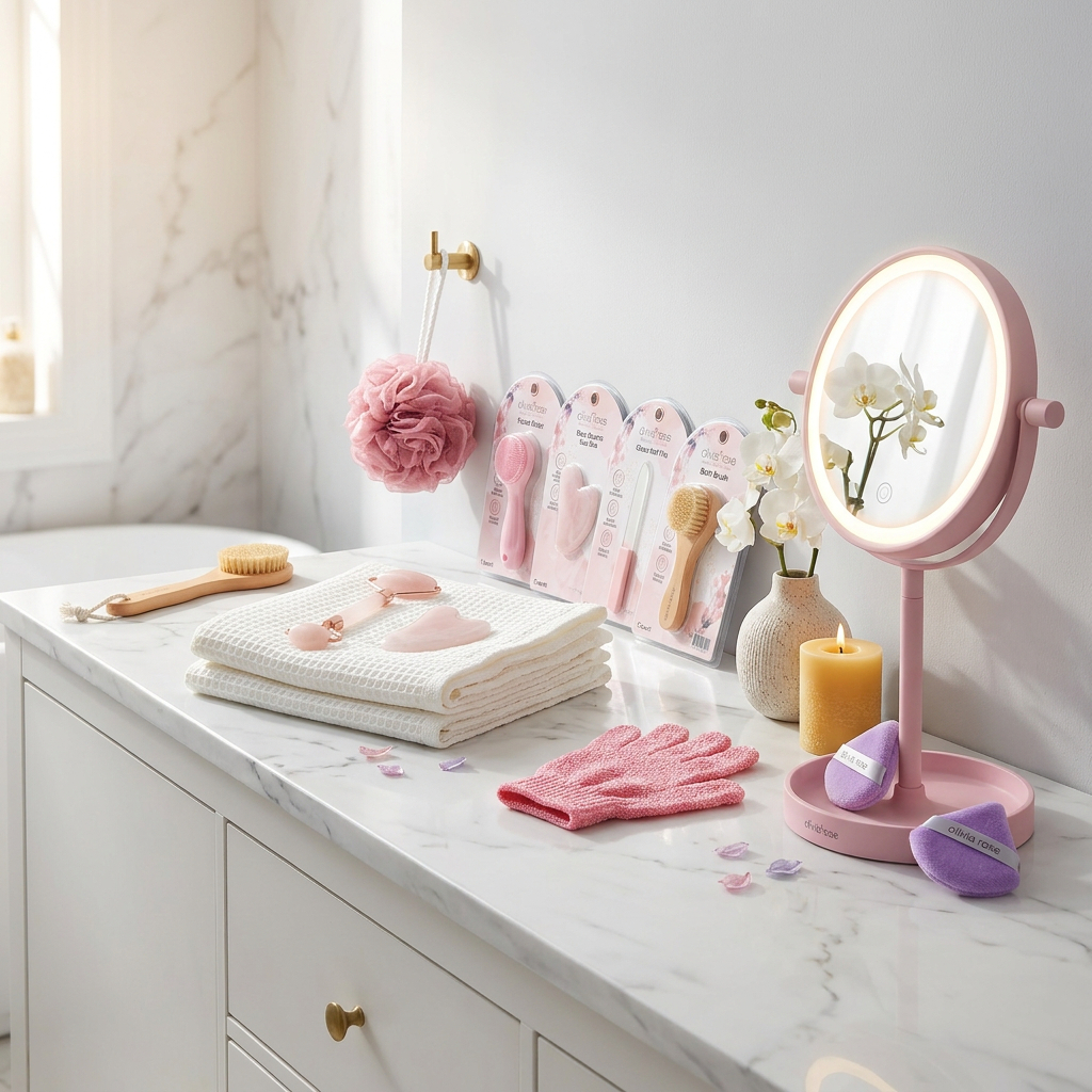
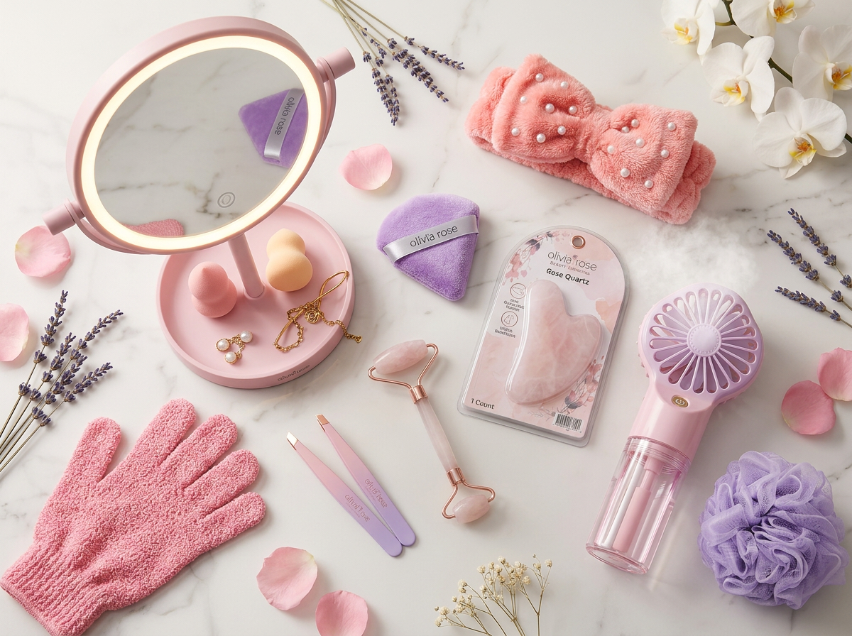
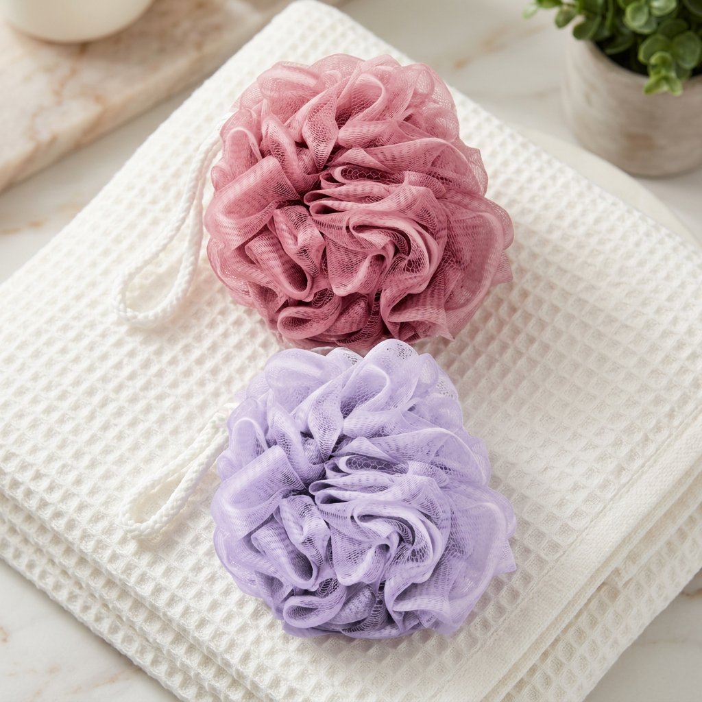
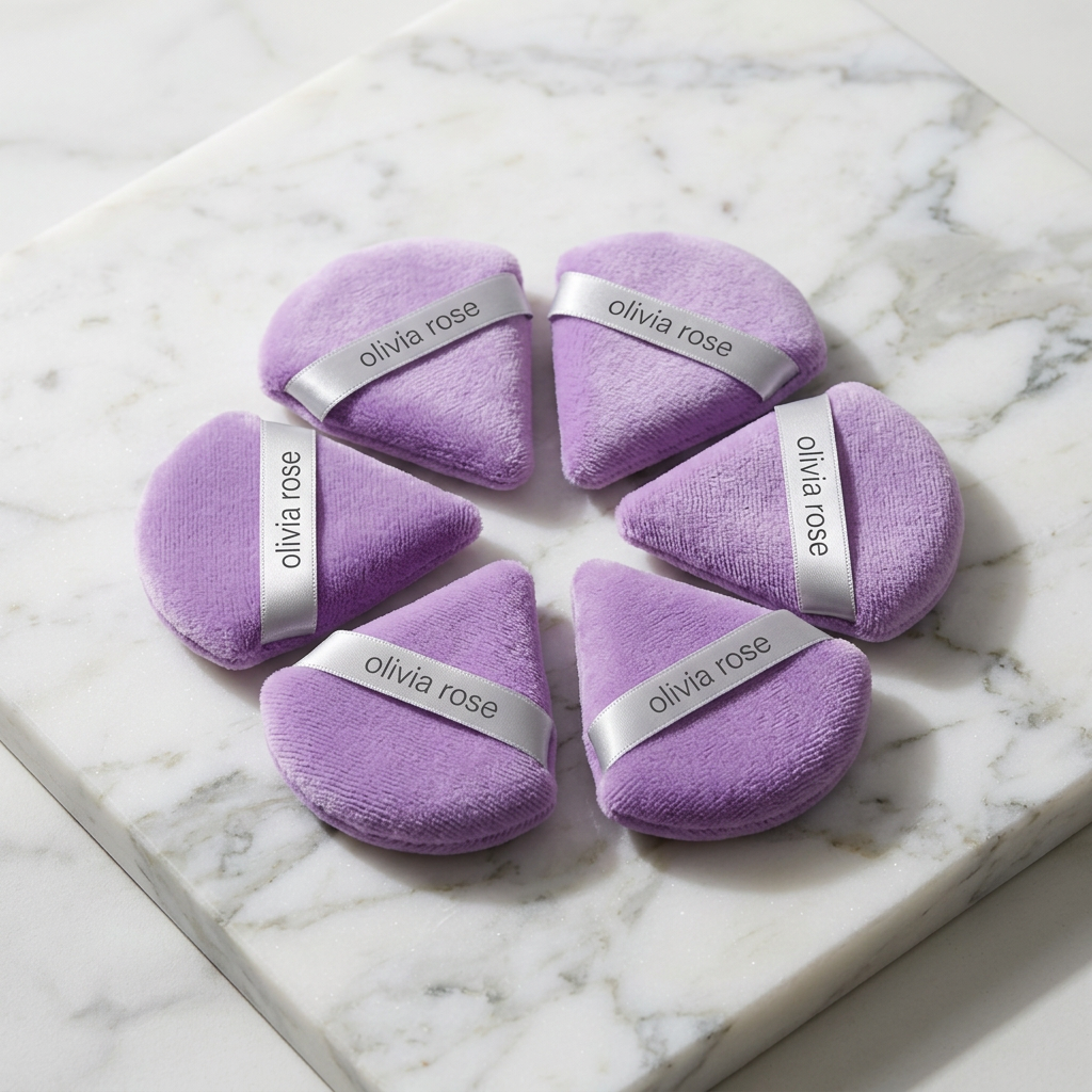
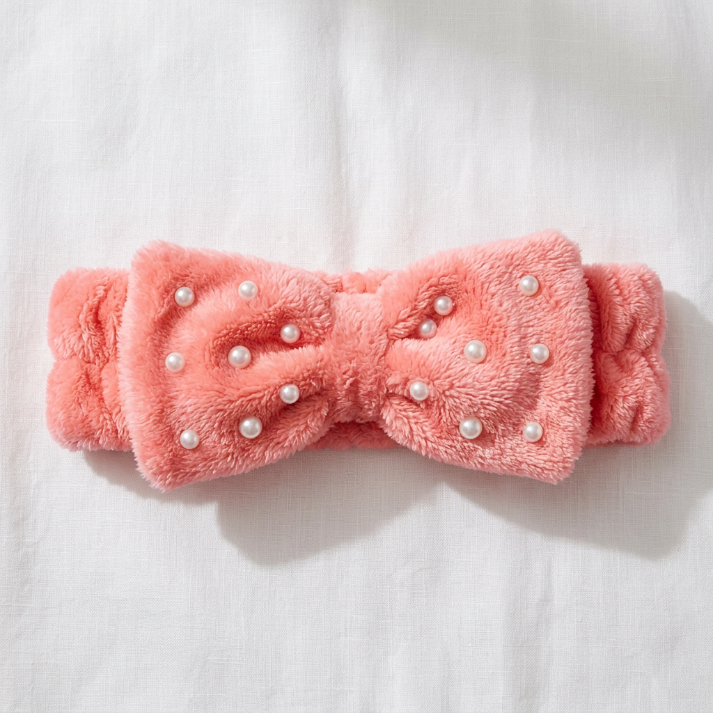
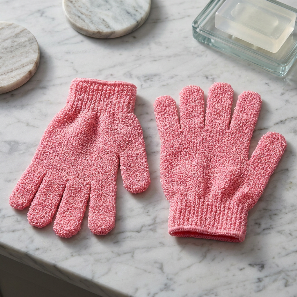
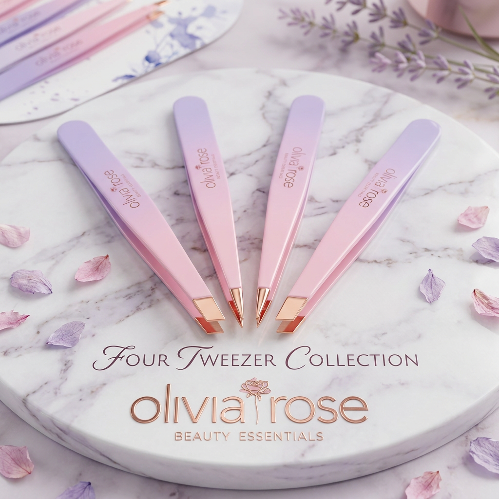
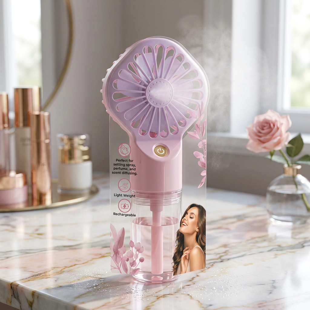
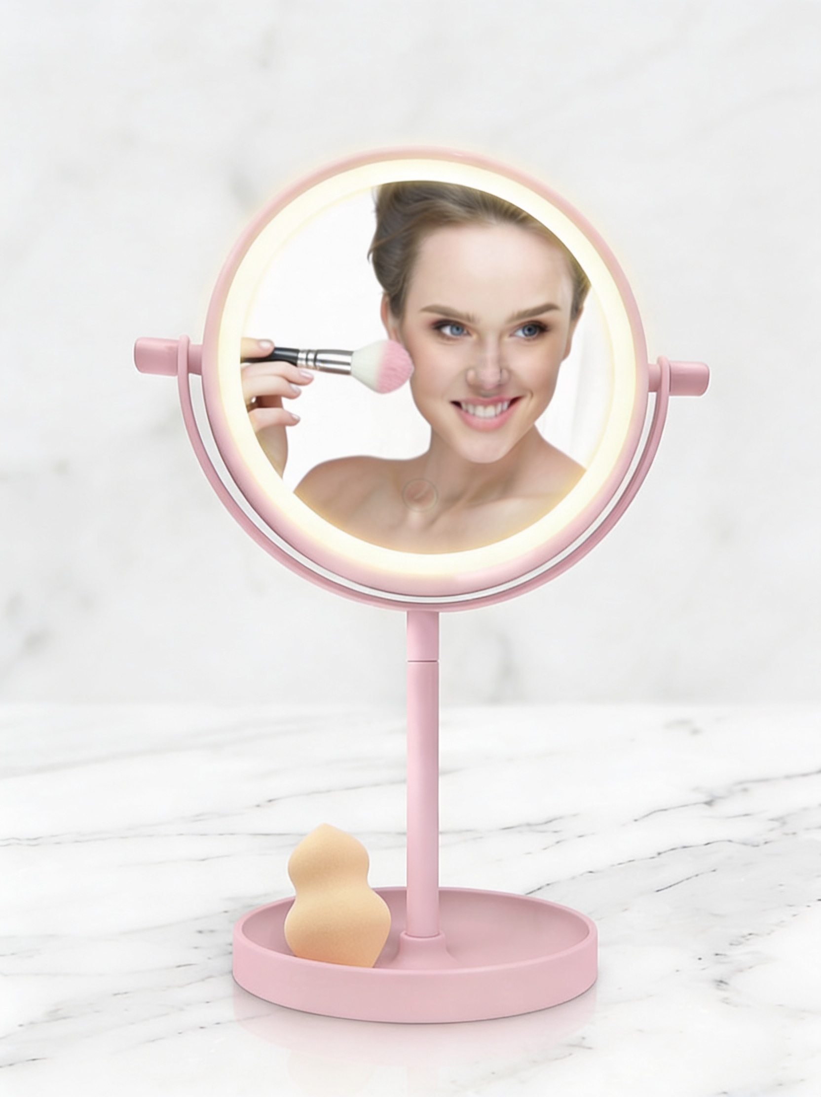
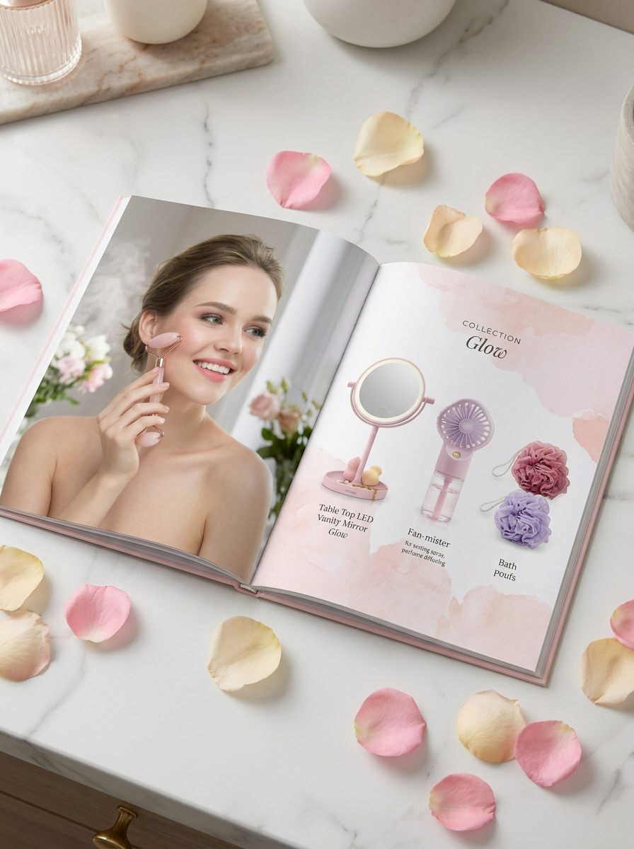
Olivia Rose carried a wide range of beauty tools and accessories — facial tools, bath essentials, vanity mirrors, makeup accessories — but without a coherent visual system or defined customer, the line read as a collection of individual SKUs rather than a considered brand.
Packaging varied in structure, graphic language, and quality cues across categories. The brand needed a system that could unify everything from an arch blister pack to a boxed LED mirror under one clear visual identity — without flattening the category diversity that made the line valuable.
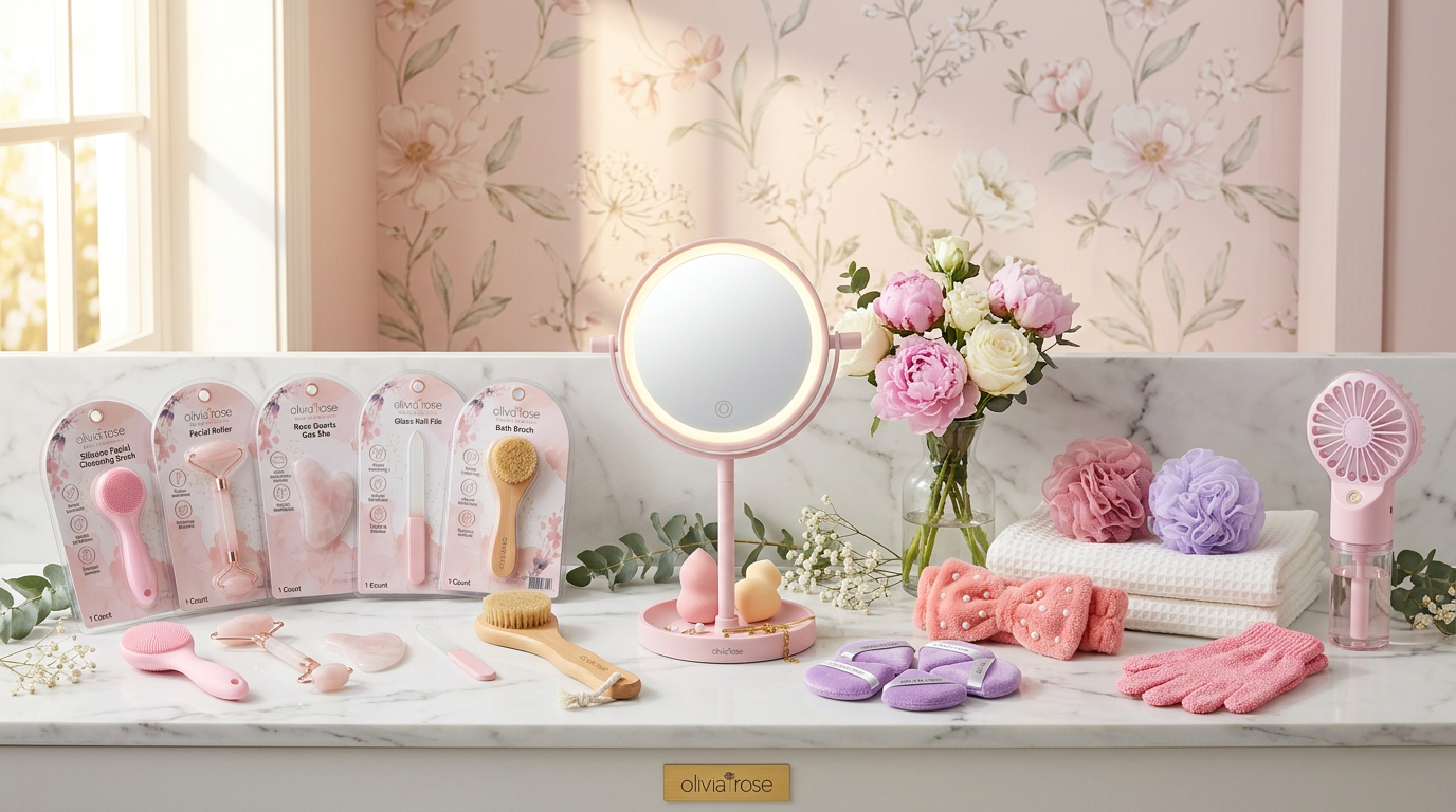
Full Product Collection
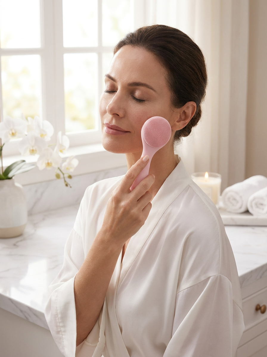
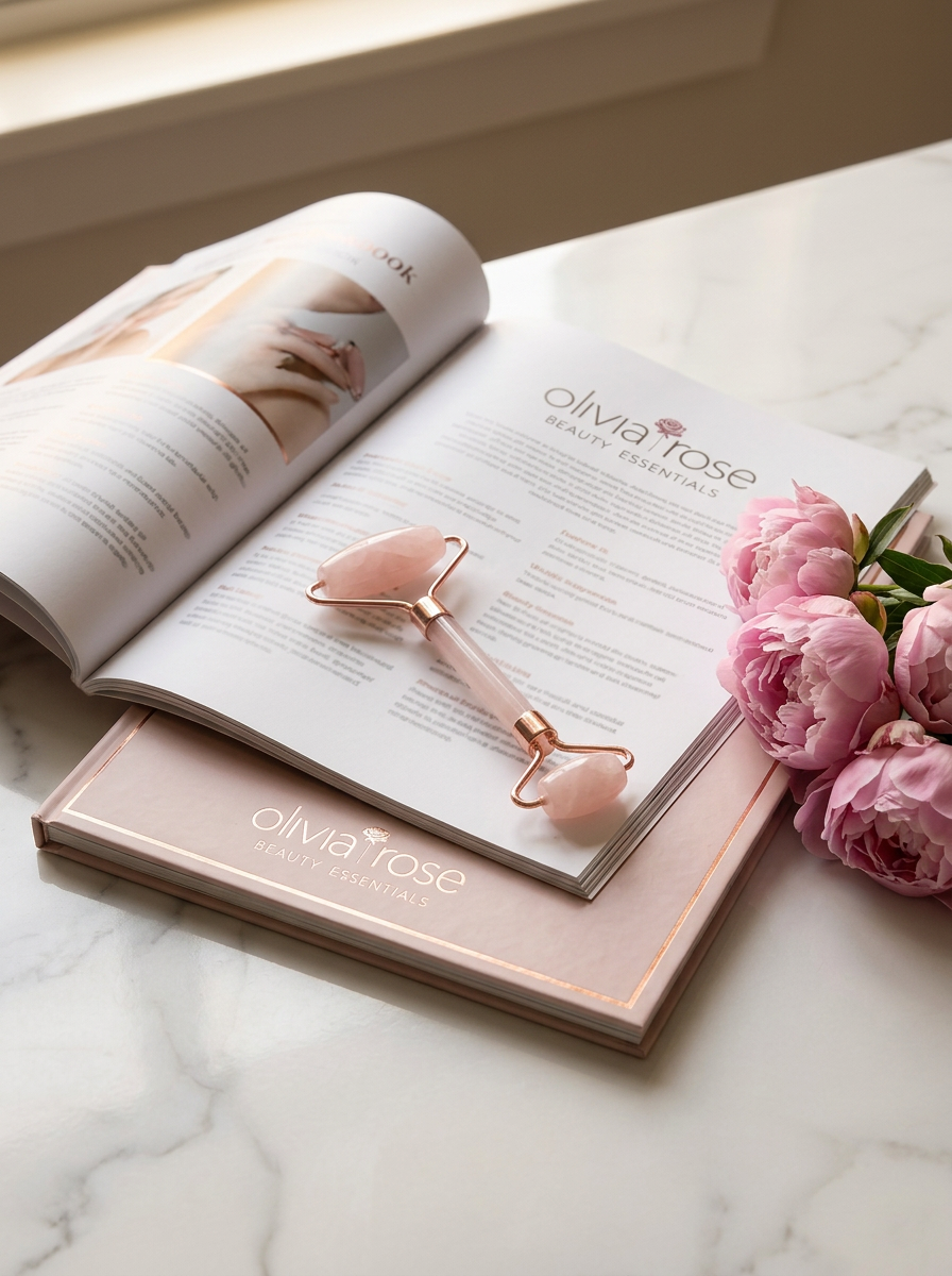
Every woman deserves tools that feel intentional — not just functional. The packaging had to say that before she even opened it.Creative Direction — Christine Farah
The repositioning anchored Olivia Rose as a premium-accessible beauty essentials brand for women 30+ — quality-forward, quietly elevated, and built for a daily ritual rather than a single occasion.
The packaging system was designed around a core arch blister format with consistent graphic language — watercolor florals, rose gold hardware, clean typography — then adapted across box formats, blister cards, and hanging packages to accommodate the full category breadth. Every touchpoint from the facial roller card to the LED mirror box speaks the same visual language.
Campaign imagery was art-directed to mirror the brand's tone: serene, light-filled, marble surfaces, natural flowers. Products are aspirational objects in a considered ritual — not tools in a medicine cabinet.
Product Line
Signature Products
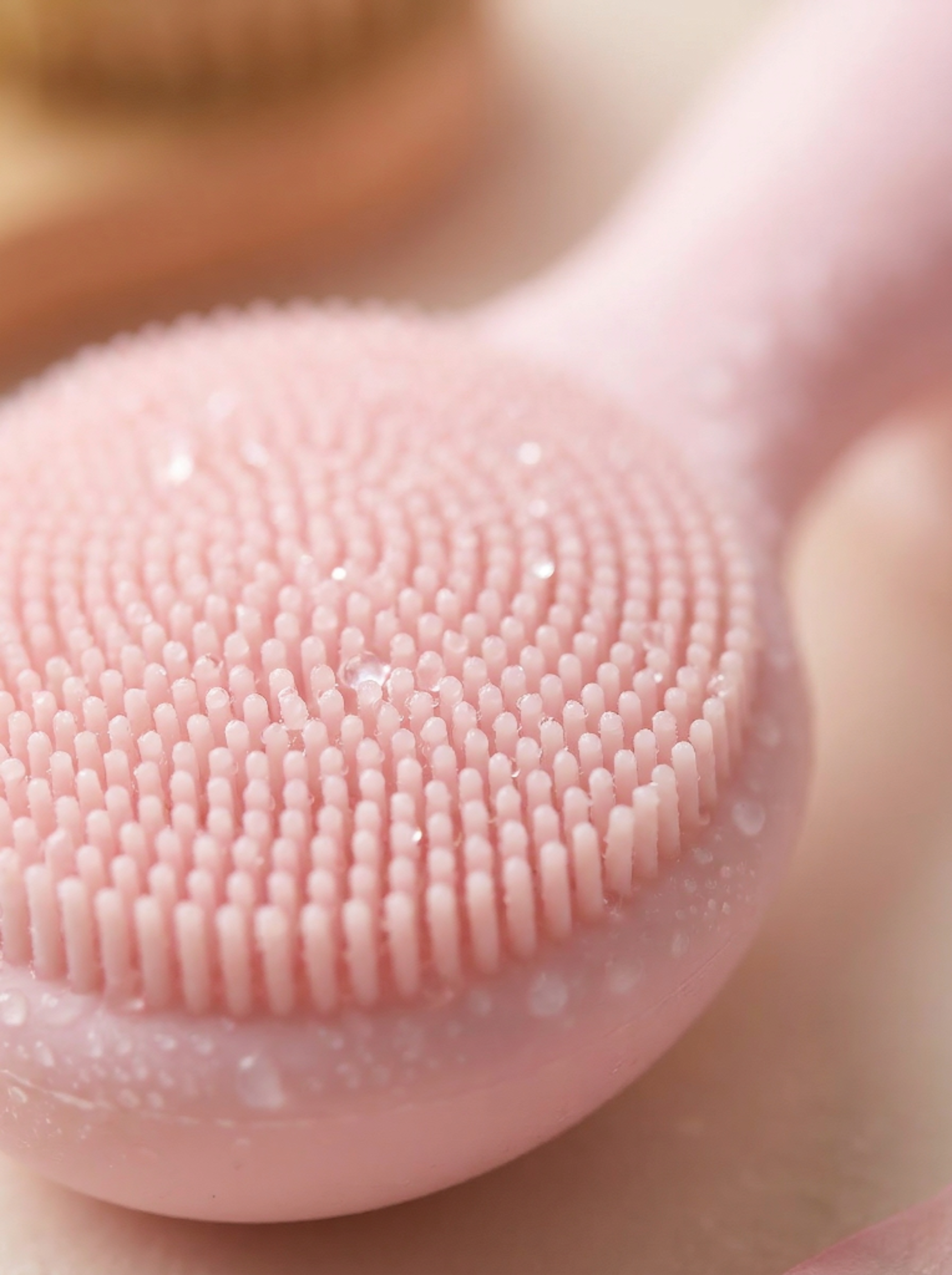
A palette of botanical softness — petal whites and dusty roses anchored by rose gold hardware and a single deep ink for typographic precision. Applied consistently across 20+ SKUs spanning facial tools, bath accessories, and vanity products.
Lookbook & Digital
Brand System & Digital Presence
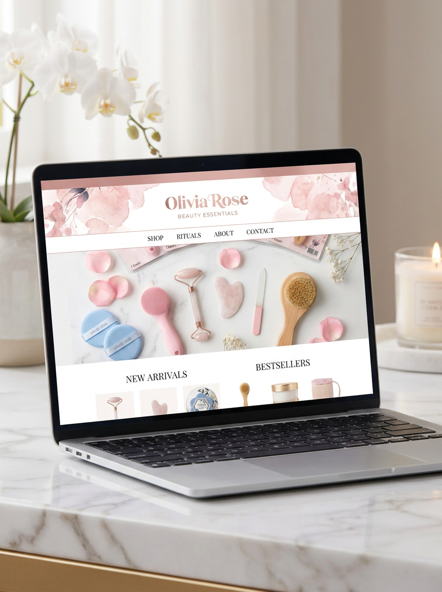
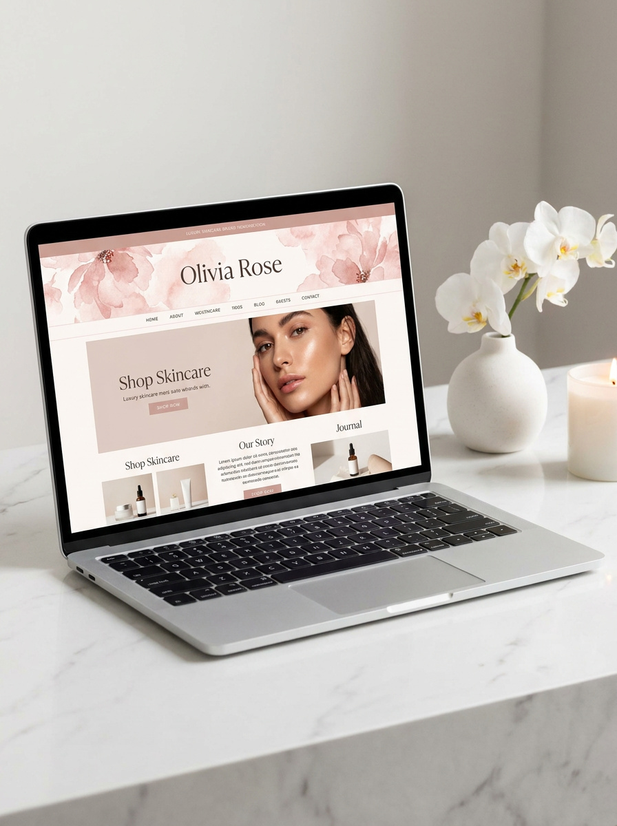
A digital presence built around the same calm and clarity as the brand
Website Design & Art Direction
Consistent system extended across every screen and surface
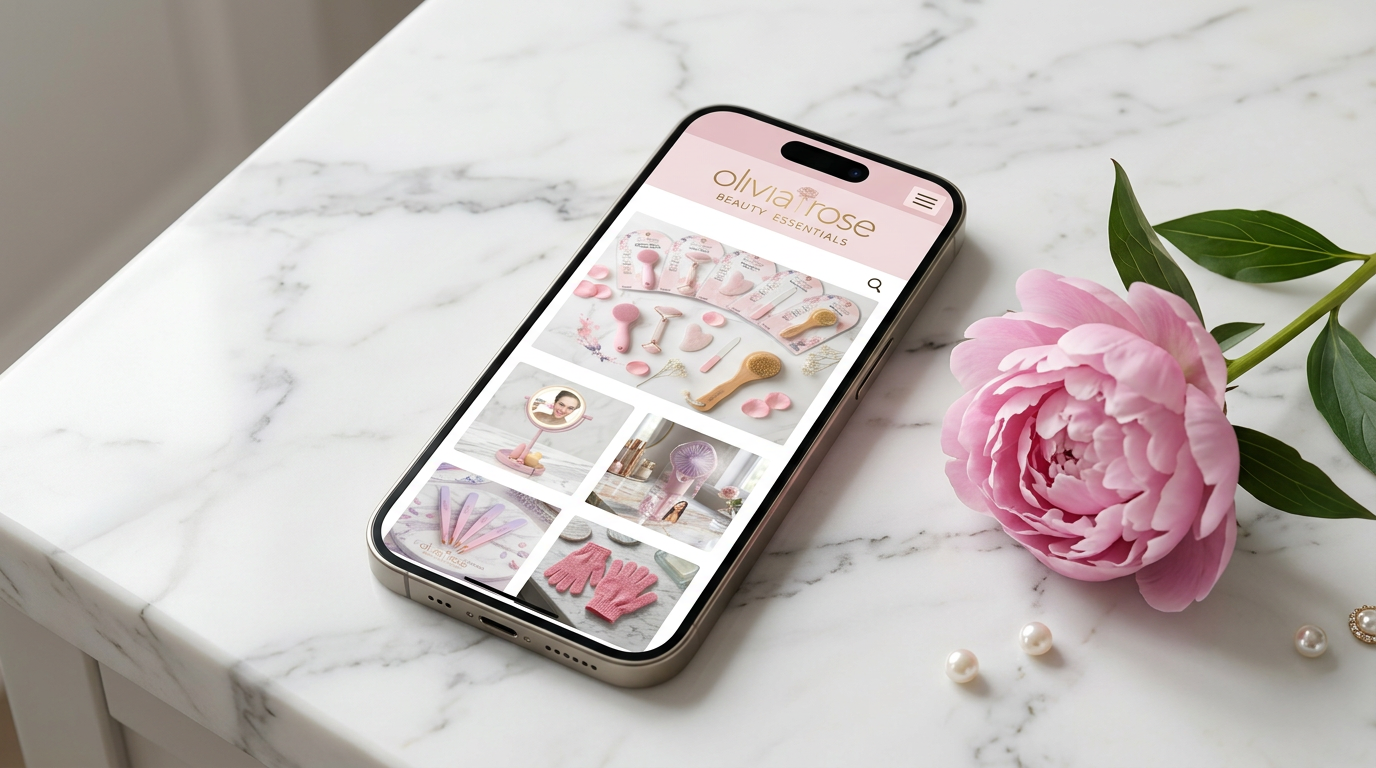
Mobile Experience & Brand System
Olivia Rose launched with a complete visual identity applied consistently across 20+ SKUs in multiple packaging formats — arch blister packs, box packaging, hanging cards — all speaking the same brand language with clarity and intention.