Brand Identity & Experience Design
HOEM
A healing sanctuary brand built to hold advanced frequency-based wellness technology — designed to feel deeply human, calm, and spiritually grounded without appearing clinical.
Brand Identity & Experience Design
A healing sanctuary brand built to hold advanced frequency-based wellness technology — designed to feel deeply human, calm, and spiritually grounded without appearing clinical.
Brand World
HOEM needed a visual identity that could hold advanced frequency-based wellness technology while feeling deeply human, calm, and spiritually grounded. The brand had to establish trust and emotional safety without appearing clinical, and evoke spirituality without leaning esoteric or ornamental.
The challenge was to design an identity where technology exists quietly within a sanctuary-like environment — present but never dominant, purposeful but never cold.
The brand had to say: you are safe here. Come as you are. Leave restored.Creative Direction — Christine Farah
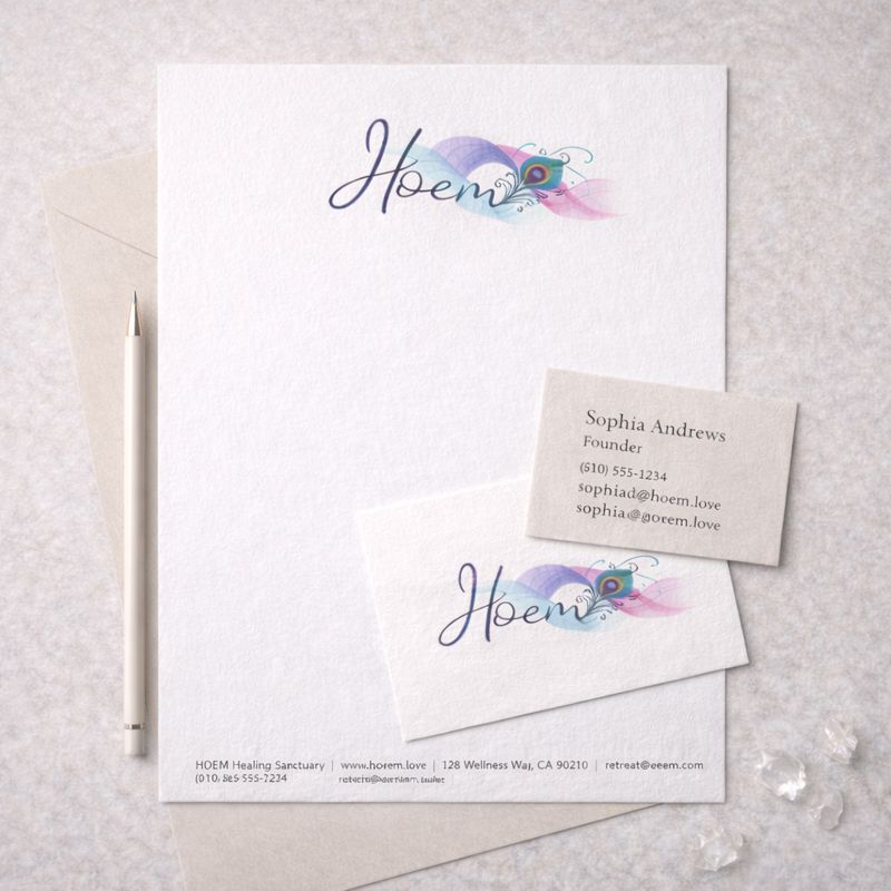
The brand was designed leading with sanctuary rather than technology. An expressive, fluid logo was created to represent energy in motion and transformation, while the surrounding visual system remained intentionally restrained.
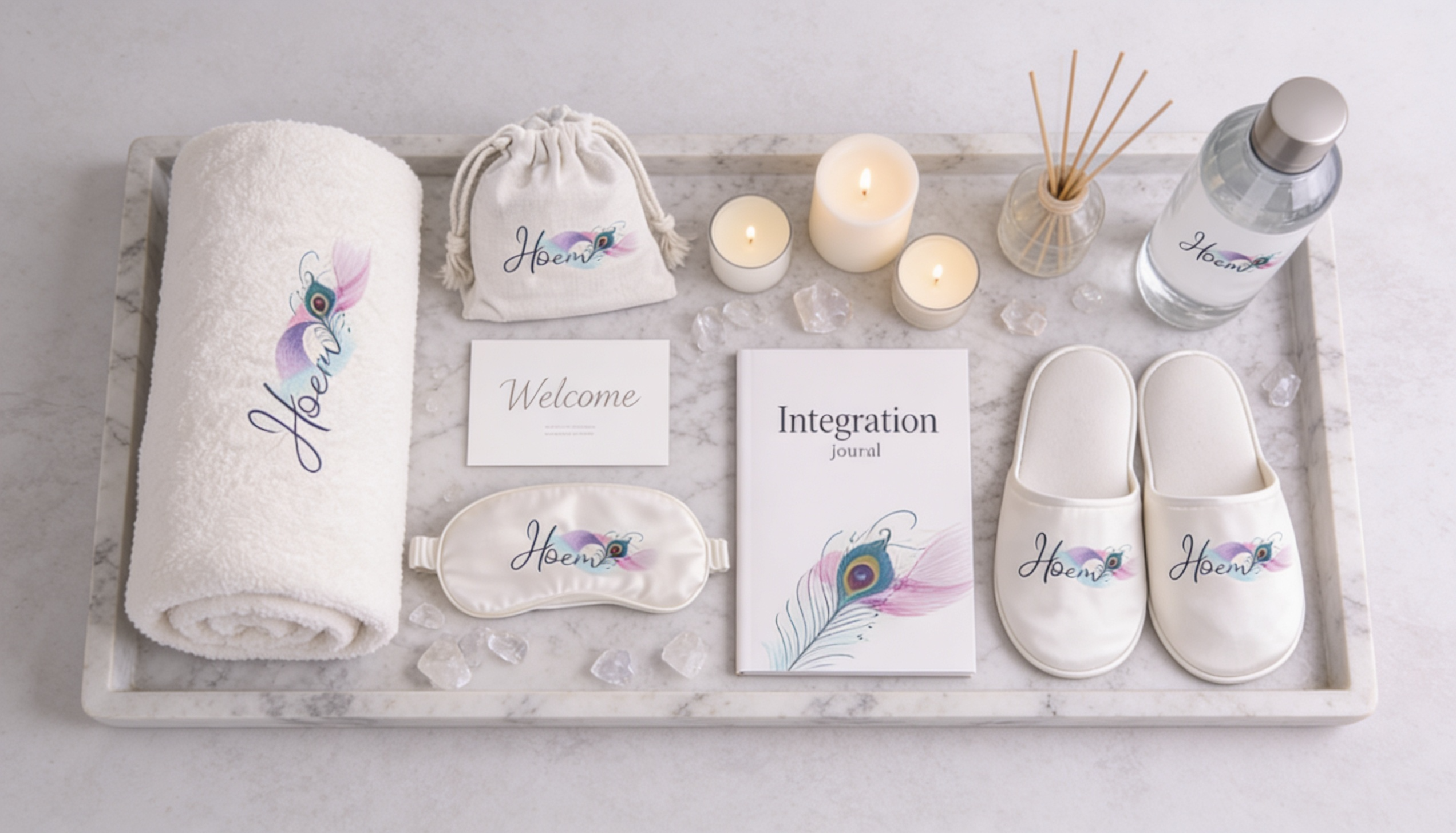
Neutral palettes, tactile materials, and generous negative space ground the identity and allow the logo's movement to feel purposeful rather than decorative. Physical and experiential touchpoints — from stationery to in-center amenities — were designed to reinforce calm, continuity, and intention at every stage of the client journey.
A palette of mineral stillness — linens and stones anchored by slate and a single deep ink. Applied consistently across every touchpoint to create an atmosphere of quiet, intentional calm.
Experience Touchpoints


The final system positions HOEM as an elevated healing brand where technology and humanity exist in quiet balance. Every touchpoint works together to create a cohesive experience that extends beyond the session — reinforcing trust, stillness, and meaningful transformation.